How to Design a Neon Sign: A Glass Fabricator's Honest Guide
TL;DR: Designing a real, hand-bent glass neon sign is a conversation between you and a fabricator — not something you drag-and-drop into existence on a website. You bring the idea, I figure out how to turn it into something that can actually be bent from glass, filled with gas, and mounted so it's still glowing in fifteen years. Here's exactly what that looks like at my studio in Echo Park.
What "designing a neon sign" actually means
I get asked about this constantly, and nine times out of ten, the person asking has just come from a website where they typed a word into a box and watched a preview pop up on screen. That's LED flex strip bent into letters. It's a fine product. It is not a neon sign.
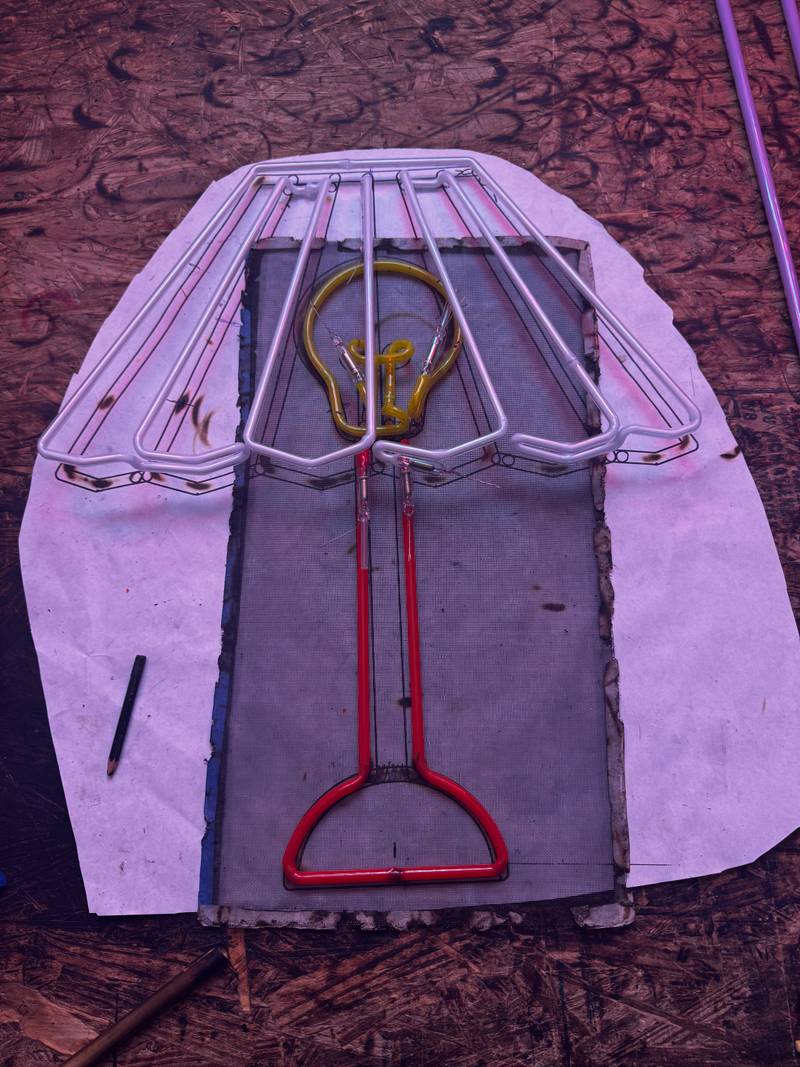
A real glass neon sign is hand-fabricated, start to finish. I heat soft lead glass tubing over a ribbon burner, bend it by hand along a full-scale paper pattern, fuse electrodes onto the ends, pull a vacuum on the tube, and fill it with neon or argon gas. What you're looking at when it's lit is ionized gas glowing inside sealed glass — not an LED tucked behind a silicone sleeve. So the design process starts way before I ever touch glass. It starts with you, and with a design that's actually possible to build.
Glass has opinions. It has a minimum bend radius. Letters need continuous paths so gas can flow end to end. Tiny enclosed loops and ultra-fine serifs just don't translate into tubing. Half of my job in the early stages is catching those problems before they turn into expensive ones later.
Step 1 — Start with your concept
Every sign I've built started the same way, whether it was a hologram-TV installation for Netflix's Sunset Blvd office or a festival stage piece — someone showed up with a clear sense of what they wanted to say.
Before you talk to a fabricator, get specific about three things:
The message or image. A word, a phrase, a logo, an illustration? The more concrete you can be, the faster we move.
The context. Where's it living — a bar wall, a trade show booth, a film set, a retail window? Context drives size, mounting, brightness, all of it.
The feeling. "Warm and vintage" and "clean and architectural" are both completely valid, and they lead to totally different font and color choices. Bring reference images if you've got them.
You don't need a finished design file yet (more on that in Step 5). You need a clear brief. Whether you're a brand manager placing a retail order or an artist commissioning a gallery piece, the sharper your brief, the better our first conversation goes.
Step 2 — The design conversation
This is where things really start. I'm not taking an order here — I'm asking questions that decide whether your sign is buildable, beautiful, and right for the space it's going into.
Here's what I'm working through with you:
Typography. If you've got a specific font in mind, I need to figure out if it bends cleanly in glass. Flowing script fonts are a dream. Thin-serif display fonts usually need some modification, and I'll tell you upfront what's possible.
Complexity. A single word in clean script is a different job than a detailed illustrative logo — different timelines, different price points. You should know that before you fall in love with a concept.
Backing and housing. Glass neon doesn't float. It mounts to something — acrylic, painted steel, raw wood, a custom frame. The backing isn't an afterthought, it's part of the design.
By the end of this conversation, I've got enough to build you a design proof — a scaled technical drawing showing the tubing path, backing dimensions, electrode positions, and mounting hardware. Not a screen render. A fabrication document.
Step 3 — Choosing your colors
Color in glass neon is chemistry, not just aesthetics, and this catches almost everyone off guard.
Here's the honest version: true neon gas glows red-orange in clear tubing — that's the classic diner-sign color everyone pictures. Argon gas glows blue-violet in clear tubing. Every other color you see — warm white, deep green, hot pink, golden yellow — comes from some combination of gas fill, phosphor coating baked inside the tube, and the color of the glass itself.
What that means for you: you're picking from a real physical palette, not a hex code. I'll show you actual samples and reference pieces, because color reads completely differently in a lit room versus a dark one, and at 12 inches versus 12 feet. For anything brand-critical — Vans came to me needing a very specific red, and there was no shortcut around seeing it in person first — I always want you looking at a real sample before we commit to production.
Color also affects how long the sign lasts. Some phosphor coatings fade faster than others. For a sign running 12 hours a day in a restaurant, I'll steer you toward the more stable options.
Step 4 — Size and mounting
This is where first-time clients most often underestimate what they're getting into. "Can we make it bigger?" is a question I hear after the fact far more than I'd like.
A few things worth knowing upfront:
Glass neon scales beautifully. LED flex starts looking thin and cheap once it gets big. Hand-bent glass gets more impressive the bigger it goes. The Netflix installation I built with my collaborator Ron the Killer ran 10 feet by 12 feet — five hologram TVs woven in with the neon — and it needed real structural planning to pull off, not just bigger tubing.
Letter height matters for legibility. Rough rule: letters need to be at least 3–4 inches tall to read cleanly up close. If it's meant to be read across a room or from the street, you want 6 inches minimum.
Mounting is structural, not decorative. Glass neon is heavier than it looks. Wall anchors, backing, transformer placement all get engineered for that specific sign. On large or outdoor installs, I bring in a structural engineer.
Getting size and mounting locked at the design stage saves you real money later. This is the point where I push you to think about the actual wall, the actual room, the actual viewing distance — not just what looks good in a mockup.
Step 5 — Approving the design before bending
Nothing gets bent until you've signed off on the proof. No exceptions, ever.
The proof is a full-scale technical drawing (or an accurately scaled version for bigger pieces). It shows:
The exact tubing path for every letter or shape
Electrode positions and splice points
Backing dimensions and material
Transformer and wiring locations
Overall installed dimensions
This is the moment to be picky. Once I start bending glass, changes get expensive — a letter that needs re-bending means new tube, new gas fill, new electrodes. Check the spelling twice. Check the dimensions against your actual wall.
If you've got a vector file — an AI or EPS from your designer — send it now, and I'll build the bending pattern off it directly. No vector file is fine too; I can work from a high-res image or even a hand sketch. What I genuinely can't work from is a 72-dpi JPEG pulled off a website. There's just not enough detail in there to trace accurately.
Approving the proof is the point of no return. After that, the craft takes over — and that part's mine to handle.
What makes a well-designed neon sign last
Built right, a glass neon sign runs 10–15 years before the gas fill needs any attention, and the glass itself can outlast that by a long shot. I've seen signs from the 1960s still glowing on their original tubes. That's the real argument for glass over LED, if you're someone who cares about that kind of thing.
But longevity gets decided at the design stage, not the finishing stage. Here's what's on my mind while I'm designing for durability:
Tube diameter. Thicker tubing holds gas pressure more reliably and shrugs off physical bumps better. For high-traffic spots, I default to a larger diameter unless the design calls for fine detail.
Splice points. Every joint between tube sections is a potential failure point down the road. Good design keeps splices to a minimum.
Transformer sizing. An undersized transformer runs hot and shortens the gas fill's life. I spec conservatively — headroom over strain, every time.
Mounting clearance. Glass neon needs airflow to shed heat. Mount it flush against a wall with zero clearance and it'll run hot and fade faster. Standoffs are standard practice in my shop, not an upgrade.
The decisions you make at the design stage are the ones that show up five years down the line. That's why I take this phase seriously — and why you should too.
FAQ
Can I design my own neon sign?
Bring your own design — I actually encourage it. What you can't do is design it the way you'd design something for print or screen. Glass has physical rules: minimum bend radii, continuous tube paths, minimum letter heights. If you've got a logo or artwork you want in glass neon, bring it to a fabricator early. I'll tell you what works as-is, what needs a little modification, and what just isn't buildable in glass. The earlier that conversation happens, the less you'll have to compromise later.
How long does the design phase take?
For something straightforward — a phrase in a clean font, one color, standard backing — the design phase usually takes 3–5 business days from first brief to approved proof. More involved projects, custom illustration, multiple colors, large-scale mounting, can run 2–3 weeks. Production (the actual bending, gas fill, and finishing) takes another 3–6 weeks depending on complexity and how backed up the shop is. Plan on 6–10 weeks total from our first conversation to an installed sign for most custom work.
What file format do I need to provide?
A vector file — Adobe Illustrator (.ai) or .eps — is ideal, since it gives me clean, scalable linework to build the bending pattern from. A high-res PDF works too. No vector art? A high-resolution raster image (300 dpi or better, PNG or TIFF) is workable for simpler designs. What doesn't work: low-res JPEGs, screenshots, images pulled off a website. If that's all you've got, talk to a graphic designer about getting it redrawn in vector before you come to a fabricator — it'll save you both time and money.
How much does a custom neon sign cost?
A small custom piece — short word or simple shape, single color, standard acrylic backing — typically starts around $800–$1,200. Mid-size signs with more complex lettering or multiple colors run $1,500–$4,000. Large-scale commercial, film, or architectural installations start at $5,000 and climb from there depending on size, engineering, and installation complexity. LED flex is cheaper upfront, but it's a different product with a different lifespan and a different look. If you're comparing quotes, make sure everyone's actually quoting the same thing.
Useful sources
Neon Signs: A Science and a Craft — Rose Kennedy Greenway — a clear, authoritative overview of the chemistry and craft behind real glass neon signs.
How Neon Signs Are Made — Neon Creations — a detailed walkthrough of the fabrication process from a long-established UK glass neon studio.
Neon Sign Gases: Neon vs. Argon — West Air Gases — technical explanation of how gas type and phosphor coatings determine color in glass neon.