The 818 Tucson - Sculptural Neon Sign Bookshelf Commission
Client: The 818 / Capstone Communities Art Consultancy: Parade Art, Seattle, WA Location: 818 E. Speedway Blvd., Tucson, AZ Completion: Fall 2027
What This Piece Is
This is a commissioned sculptural bookshelf designed to look like a vintage neon sign - custom neon-inspired furniture built for The 818, a 165-unit, 532-bed luxury student housing development at 818 E. Speedway Blvd. in Tucson, Arizona, developed by Capstone Communities and designed by Ankrom Moisan architects. The building opens Fall 2027, steps from the University of Arizona campus.
To be precise about what this piece is and isn't: there is no glass, no gas, no transformer, no wiring, and no electricity. The bookshelf does not light up. It is a purely sculptural object - one that borrows the visual language of a vintage neon sign.
That distinction matters, and it's also what makes this commission interesting.
How the Commission Came Together
Parade Art, a Seattle-based art consultancy with over 30 years of combined experience developing custom art programs for residential and multi-family housing developments, reached out to bring me into the art program for The 818. They work across the full spectrum - murals, sculpture, mixed media, site-specific commissions - and for this project they were building a collection that would give the building a genuine sense of place rather than generic hospitality art.
The brief they brought me was specific: a functional bookshelf that evoked a custom neon sign, designed to live permanently in the lobby, the piece needed to work as furniture first - something residents would actually use - and as a sculptural neon reference second. It also needed to hold up in a high-traffic residential environment, which is a different durability standard than a gallery or a restaurant.
The creative challenge was real. A bookshelf and a neon sign have almost nothing in common structurally or materially. One carries weight, stays level, and anchors to a wall. The other is made of sealed glass tubes shaped by hand over a flame, fragile by nature, and read primarily as light. Getting a piece of furniture to feel like a neon sign - without actually being one - meant figuring out what it is about neon that people respond to, and then finding a way to deliver that response through form alone.
The Design Challenge: Neon Without Neon
People respond to vintage neon signs for specific reasons. It's not just the light - it's the curves. The way a skilled glass bender draws a letterform or a shape in a single continuous tube, looping and doubling back on itself, creating something that looks both hand-drawn and three-dimensional at the same time. There's a retro warmth to it, a craft quality that reads immediately even to someone who has never thought about how neon is actually made.
The question this commission asked me to answer was: how do you capture that in a piece of furniture?
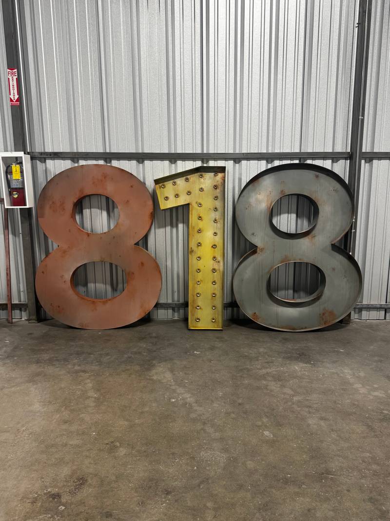
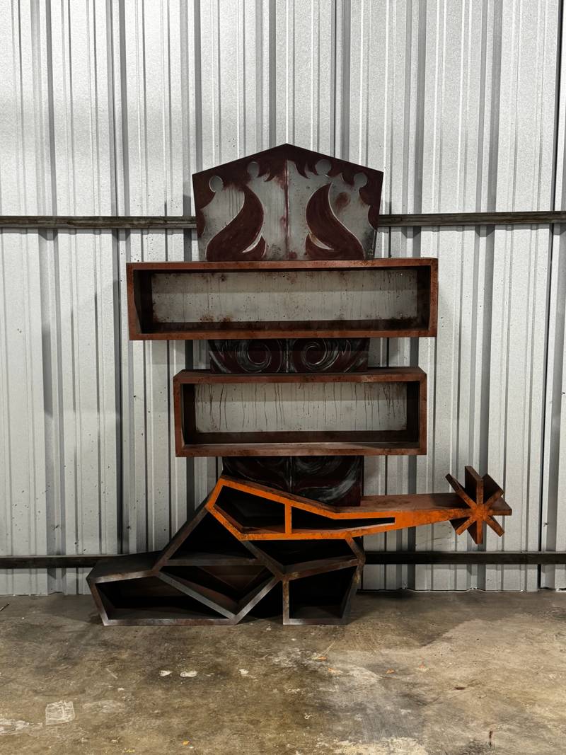
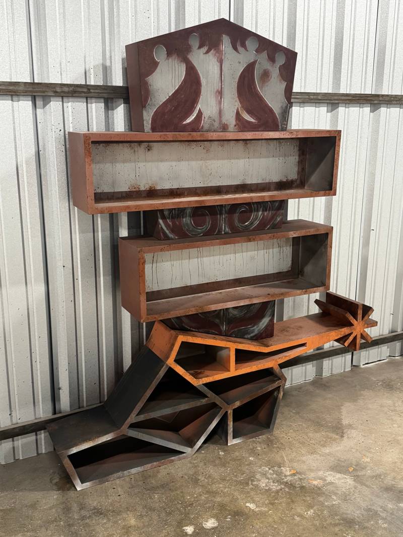
The color palette was chosen to reinforce the aged vintage neon reference. Many shades of Sherwin Williams rust and sun age colors. In a well-lit room, the piece reads as furniture. Step back, and the overall silhouette reads as a sign. That double-read is the goal.
The Build
Structural Logic
I started with the structural problem, not the aesthetic one. A bookshelf that evokes neon can't just look like neon - it has to hold books, stay level under load, and anchor to a wall safely. Those requirements don't go away because the piece is also a sculpture.
The shelving surfaces themselves are welded from stainless steel to hold merch items for the 818 like water bottles and hoodies. The proportions were calibrated so the shelves read as secondary to the tubular forms - present and functional, but not visually dominant. You see the curves first. You notice the shelves when you start thinking about using the piece.
Fabrication
The fabrication process was intense, we needed to make the structure out of stainless steel to accurately execute the shape of all the bookshelves. Stainless Steel is a notoriously hard metal to work with and make holes required.
Everything was welded and prepared at a fabrication shop in Los Angeles
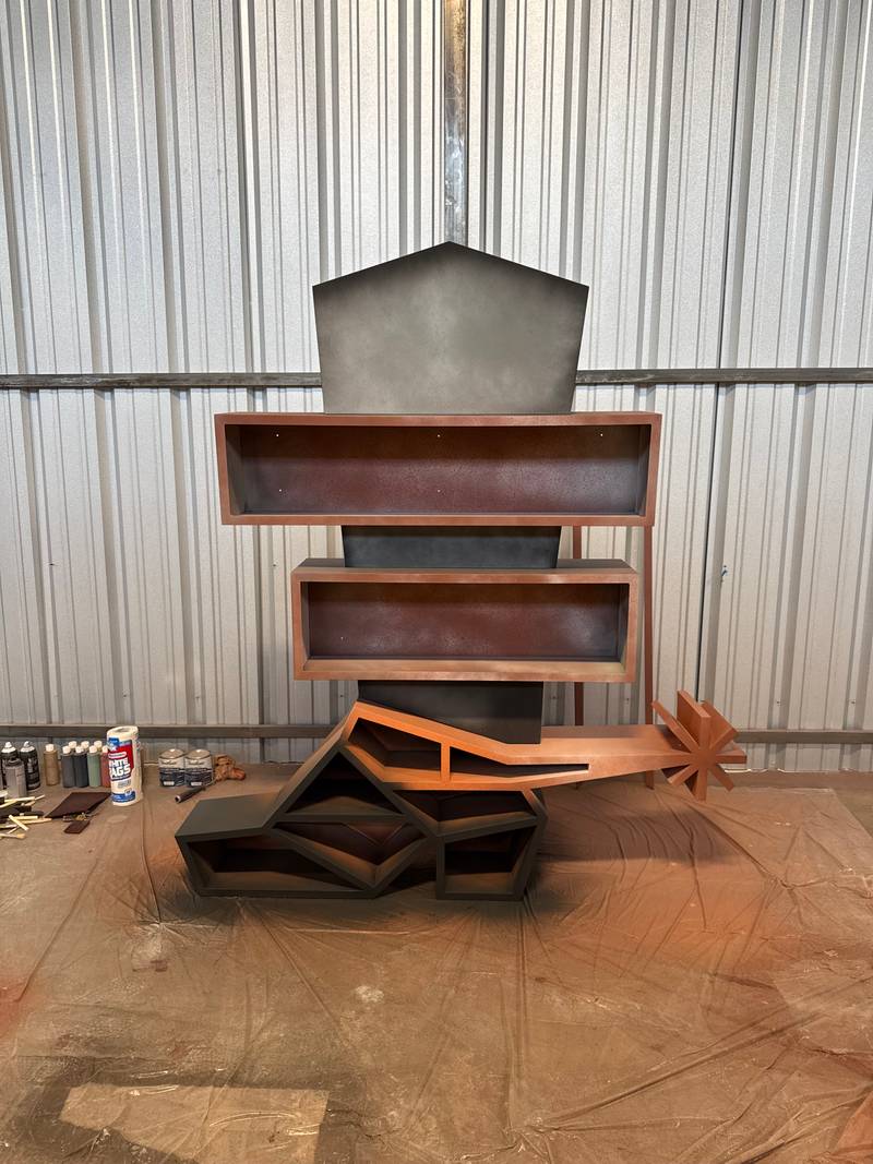
Then for the painting segment the metal was primed and layer upon layer of the pre selected aged sun kissed color palette was applied until the look of years of age and rust weee achieved.
The piece was assembled in the Echo Park studio and checked for level, load capacity, and wall-anchor geometry before shipping. A bookshelf that arrives in Tucson and doesn't sit level is a problem. A bookshelf that arrives and doesn't look like a neon sign is a bigger one.
The Finished Piece
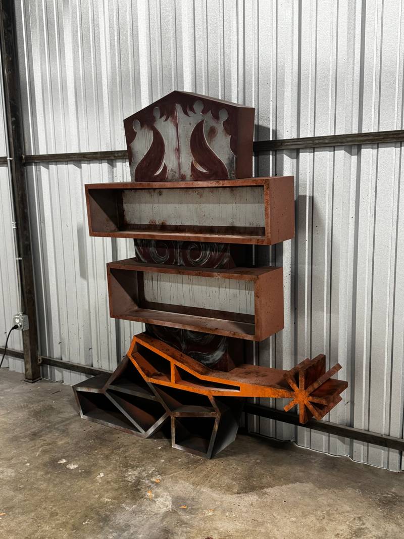
The bookshelf is currently located in the back of the temporary leasing office and will be moved to the lobby of the finished location once the construction is complete. The bookshelf holds real books and objects. During the day, it reads as a piece of custom furniture with an unusual formal quality - the curves are immediately legible as a neon reference, but the piece functions exactly as furniture should. There's no light to turn on, no maintenance to schedule, no fragile glass to protect. It just exists in the space, doing both things at once.
That's what the piece is supposed to do. It's not trying to be a vintage neon sign - it's not pretending to be something it isn't. It's a sculpture that speaks the visual language of neon, built into an object that students are going to walk past, set their books on, and live with every day for years. The goal was to make something that earns a second look every time - not because it's loud, but because the idea behind it is genuinely unusual.
What This Commission Represents
Most of what I build lives on walls. Signs for restaurants, brand installations, film sets, gallery pieces - the neon is the thing, and the wall is just the surface it hangs on.
This commission asked for something different. It asked for the visual identity of neon to become part of an object that has its own structural logic, its own functional purpose, and its own relationship to the people using the space. There's no glass in this piece. There's no gas, no transformer, no electricity. What there is, instead, is a design problem that took everything I know about how neon signs are built and asked me to solve it without any of the materials I normally use. That's a harder problem, and it's the kind of problem I want more of.
Working with Parade Art on a $76M institutional development like The 818 - a building designed by Ankrom Moisan for Capstone Communities, serving hundreds of students near the University of Arizona - puts the work in a context that matters. This isn't a one-night event installation or a pop-up backdrop. It's a permanent piece in a permanent building, and it will be part of that building's identity for as long as the building stands.
That's the direction I'm building toward with Neon Flamingo: large-scale, institutional, functional art that goes beyond the sign and into the space itself - and occasionally, beyond neon entirely.